
Color Psychology in Interior Design: How to Choose the Perfect Palette for Your Home
The power of color extends far beyond mere aesthetics in interior design. Color psychology in interior design plays a crucial role in shaping the mood, atmosphere, and even functionality of our living spaces. By understanding how different hues affect our emotions and behaviors, we can create environments that not only look beautiful but also support our well-being and daily activities. This guide will explore how to harness the potential of color psychology to transform your home into a harmonious and inspiring sanctuary.
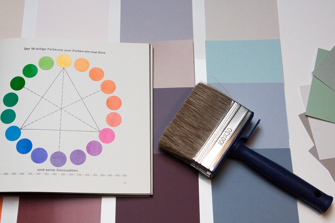
The Basics of Color Psychology
Color psychology is the study of how colors influence human behavior, emotions, and physiological reactions. In interior design, this knowledge is invaluable for creating spaces that evoke specific feelings and support intended uses.
Warm vs. Cool Colors
Colors are generally categorized as warm or cool, each group having distinct psychological effects:
| Warm Colors | Psychological Effect | Cool Colors | Psychological Effect |
|---|---|---|---|
| Red | Passion, energy, excitement | Blue | Calmness, serenity, trust |
| Orange | Enthusiasm, creativity, stimulation | Green | Balance, harmony, growth |
| Yellow | Happiness, optimism, clarity | Purple | Luxury, mystery, spirituality |
| Pink | Love, nurturing, compassion | Teal | Tranquility, clarity, refreshment |
Warm colors tend to energize and stimulate, making spaces feel cozy and intimate. Cool colors, on the other hand, promote relaxation and can make rooms appear larger and more spacious.
The Impact of Neutrals
Neutral colors serve as the foundation of many interior design schemes, offering versatility and balance. They can soften bold color choices or stand alone for a sophisticated, timeless look.
Popular neutral shades and their best uses:
- White: Creates a clean, fresh backdrop; ideal for minimalist designs
- Beige: Adds warmth without overwhelming; perfect for creating a cozy atmosphere
- Gray: Offers modern sophistication; works well in contemporary spaces
- Taupe: Bridges warm and cool tones; excellent for transitional styles
- Black: Provides drama and depth; use sparingly for accents or to ground a space
- Brown: Brings natural warmth; great for rustic or earthy interiors
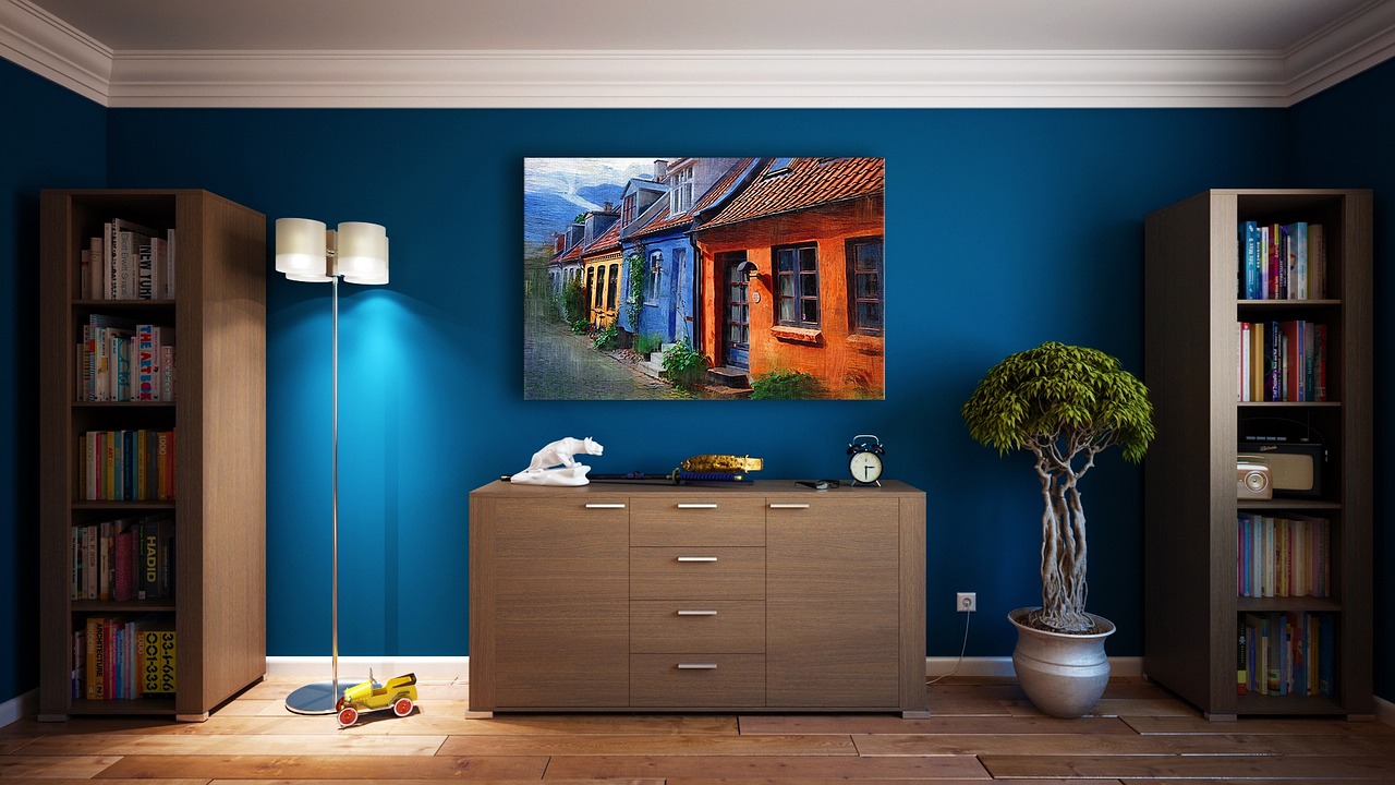
Selecting the Right Color Palette for Each Room
Different rooms serve different purposes, and their color palettes should reflect and support these functions.
Living Room Color Choices
The living room is often the heart of the home, where family and friends gather. Colors should promote relaxation and encourage social interaction.
Recommended color schemes for a welcoming living room:
- Warm neutrals with pops of blue or green for a calming yet inviting atmosphere
- Earthy tones like terracotta and olive for a cozy, grounded feel
- Soft grays with yellow accents for a modern, cheerful vibe
- Navy blue and cream for a classic, sophisticated look
- Pastel shades for a light, airy feel that promotes conversation
Bedroom Colors for Restful Sleep
The bedroom should be a sanctuary that promotes relaxation and restful sleep.
Soothing color combinations for better sleep:
- Soft blue and white for a serene, cloud-like atmosphere
- Lavender and light gray for a calming, spa-like retreat
- Sage green and beige for a nature-inspired, tranquil space
- Pale pink and ivory for a gentle, nurturing environment
- Deep teal and cream for a cocooning, restful ambiance
Kitchen Colors for Energy and Appetite
The kitchen is a hub of activity where color can influence energy levels and even appetite.
| Energetic Color | Impact on Kitchen Environment |
|---|---|
| Yellow | Stimulates appetite, promotes happiness and sociability |
| Red | Increases energy, stimulates appetite (use sparingly) |
| Orange | Enhances enthusiasm, encourages conversation |
| Green | Promotes balance, associated with healthy eating |
| White | Creates a clean, fresh atmosphere |
Choose colors based on the primary function of your kitchen—whether it’s a space for cooking, entertaining, or both.
How to Use Accent Colors
Accent colors add depth, interest, and personality to a room’s design, creating visual focal points and tying the space together.
Creating Focal Points with Accent Colors
Accent colors can draw attention to specific areas or elements in a room:
- Paint an accent wall in a bold, contrasting color
- Use colorful throw pillows or blankets on neutral furniture
- Incorporate a vibrant area rug in an otherwise subdued room
- Choose a statement piece of furniture in a bright hue
- Hang colorful artwork against a neutral background
- Add pops of color with decorative accessories or plants
- Use colored lighting fixtures or lampshades for subtle accents
Balancing Accent Colors with the Overall Palette
When introducing accent colors, it’s crucial to maintain balance with the room’s base palette:
| Base Color | Complementary Accent Color |
|---|---|
| Blue | Orange or Yellow |
| Green | Red or Purple |
| Purple | Yellow or Green |
| Gray | Any bright color (Red, Blue, Yellow) |
| Beige | Navy, Forest Green, or Burgundy |
| White | Any color (use consistently for cohesion) |
The key is to use accent colors judiciously, typically following the 60-30-10 rule: 60% dominant color, 30% secondary color, and 10% accent color.
By understanding and applying color psychology in interior design, you can create a home that not only looks beautiful but also supports your emotional well-being and daily activities. Remember that personal preferences and cultural associations also play a role in how we perceive colors, so don’t be afraid to experiment and find what works best for you and your space. With thoughtful color choices, you can transform your home into a harmonious environment that reflects your personality and enhances your quality of life.
Color Trends in Interior Design
Staying informed about current color trends can inspire fresh ideas for your home decor while keeping your space feeling contemporary and stylish.
Trending Colors for Modern Homes
Modern interior design often reflects a balance between timeless elegance and bold innovation. Here are some of the most popular colors in contemporary interior design:
- Sage Green: A calming, nature-inspired hue
- Use in living rooms for a fresh, organic feel
- Perfect for kitchen cabinets or a bedroom accent wall
- Warm Neutrals: Beige, taupe, and earthy tones
- Ideal for creating a cozy, inviting atmosphere in any room
- Use as a base color in living areas or bedrooms
- Dusty Blue: A soft, sophisticated shade
- Great for bedrooms or home offices to promote tranquility
- Use as an accent color in neutral-toned living spaces
- Terracotta: A rich, warm earth tone
- Perfect for adding warmth to kitchens or dining areas
- Use as an accent color in living rooms or entryways
- Charcoal Gray: A modern alternative to black
- Ideal for creating drama in powder rooms or studies
- Use as an accent wall color in bedrooms or living rooms
How to Adapt Trends to Your Personal Style
Incorporating trendy colors doesn’t mean sacrificing your personal style. Here’s how to blend current trends with different design aesthetics:
| Design Style | Trending Color | How to Incorporate |
|---|---|---|
| Minimalist | Sage Green | Use as a subtle accent color in artwork or small decor items |
| Bohemian | Terracotta | Incorporate through textiles like rugs or throw pillows |
| Scandinavian | Dusty Blue | Use as a wall color in combination with light woods and whites |
| Industrial | Charcoal Gray | Apply to metal fixtures or as a statement wall color |
| Coastal | Warm Beige | Use as a base color, pairing with blues and whites for contrast |
Remember, the key is to use trending colors in ways that complement your existing style rather than overpowering it.
The Psychological Impact of Color Combinations
The way colors are combined can significantly influence the overall mood and atmosphere of a space.
Harmonious vs. Contrasting Palettes
Harmonious (analogous) and contrasting (complementary) color palettes each have unique psychological effects:
| Palette Type | Description | Psychological Impact | Best Used For |
|---|---|---|---|
| Harmonious | Colors adjacent on the color wheel | Creates a sense of unity, calmness, and cohesion | Relaxing spaces like bedrooms or reading nooks |
| Contrasting | Colors opposite on the color wheel | Adds energy, visual interest, and excitement | Living areas, creative spaces, or to create focal points |
Harmonious palettes tend to be more soothing and create a sense of flow, while contrasting palettes can energize a space and make it feel more dynamic.
Creating Balance with Monochromatic Schemes
Monochromatic color schemes use variations in lightness and saturation of a single color. This approach can create a sophisticated, cohesive look.
Tips for successfully using a monochromatic color scheme:
- Start with a base shade and include lighter and darker variations
- Incorporate different textures to add depth and interest
- Use metallic accents to break up the monotony
- Include plenty of white or off-white to prevent overwhelming the space
- Vary the intensity of the color throughout the room
- Use patterns in the same color family to add visual interest
- Consider adding plants for a natural contrast
Monochromatic schemes can be particularly effective in creating a calm, unified space, such as in bedrooms or home offices.
Conclusion
Color psychology plays a vital role in interior design, influencing not just the look of our spaces but also how we feel and behave within them. By understanding the emotional impact of different colors and their combinations, you can create a home that not only reflects your personal style but also supports your well-being and daily activities.
Remember that while color trends can offer fresh inspiration, the most important factor is how the colors make you feel in your space. Don’t be afraid to experiment with different palettes, keeping in mind the function of each room and the atmosphere you want to create. Whether you opt for a calming monochromatic scheme in the bedroom, an energizing contrast in the home office, or a harmonious blend in the living room, let your color choices reflect your personality and enhance your living experience.
Ultimately, the perfect color palette is one that makes you feel at home, comfortable, and inspired. By applying the principles of color psychology and staying true to your personal preferences, you can create a space that is both beautiful and emotionally supportive. So go ahead, pick up that paint brush or choose that bold piece of furniture – your perfect color palette awaits!